DAWSON MOOR SELLS DOORS AND MORE...
BACKGROUND
A range of door hardware and accessories is launching on a US e-commerce site. Everything is ready to go, all it needs is a name and an eye-catching identity.
DISCOVERY
Crowded e-commerce platforms that sell a wide variety of brands can be highly competitive. Following some lightweight market research we quickly recognised an opportunity to stand out in this crowd by tailoring the name and identity towards a B2C audience. This would drive the creative brief. Working with the client we drafted three guiding principles; the name had to feel established, the logo had to be modern, and colours were free to explore.
DELIVERY
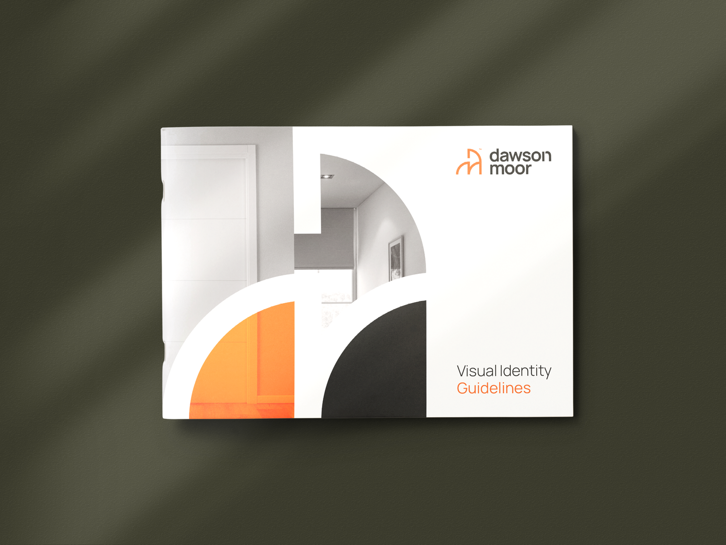
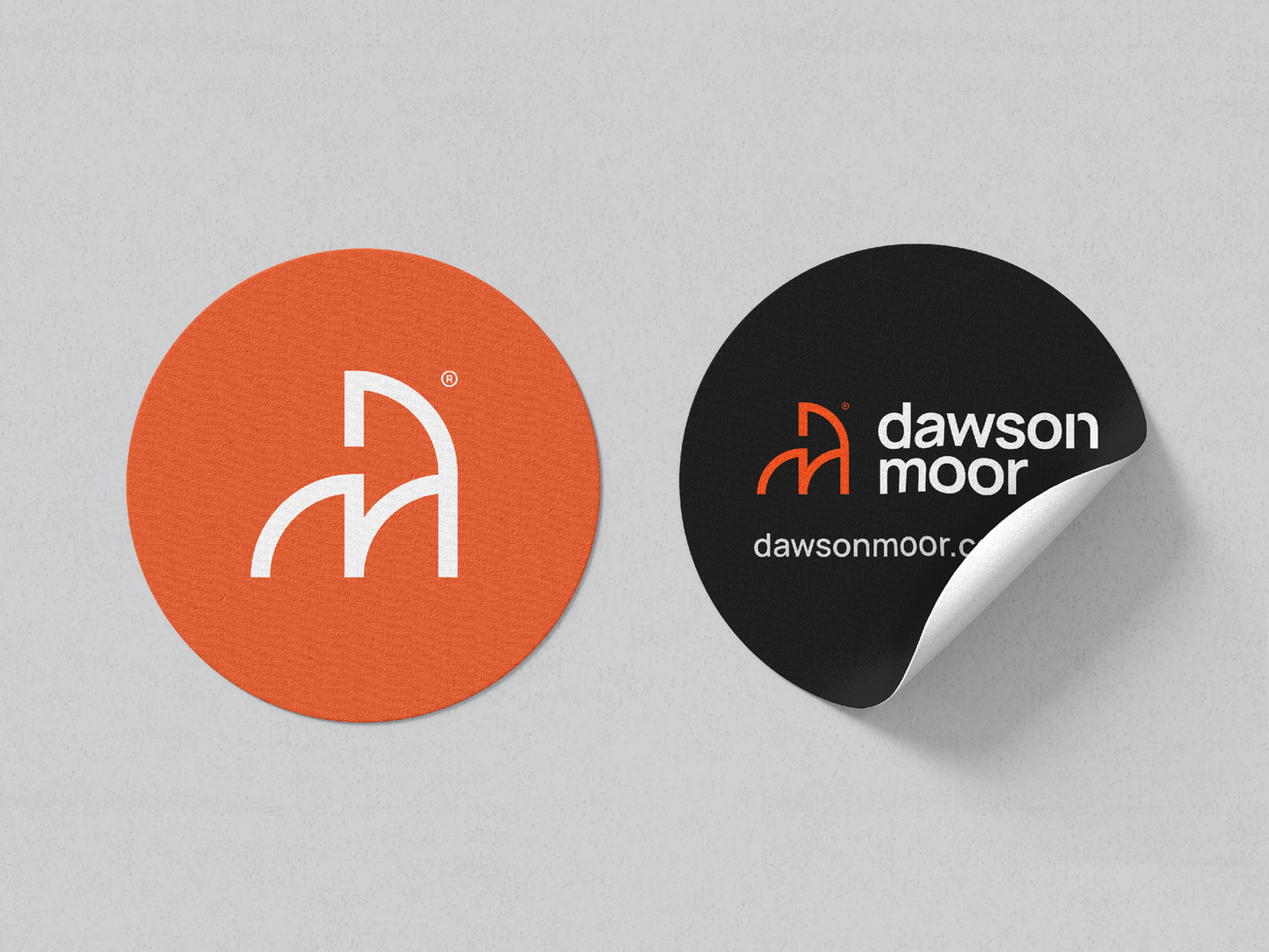
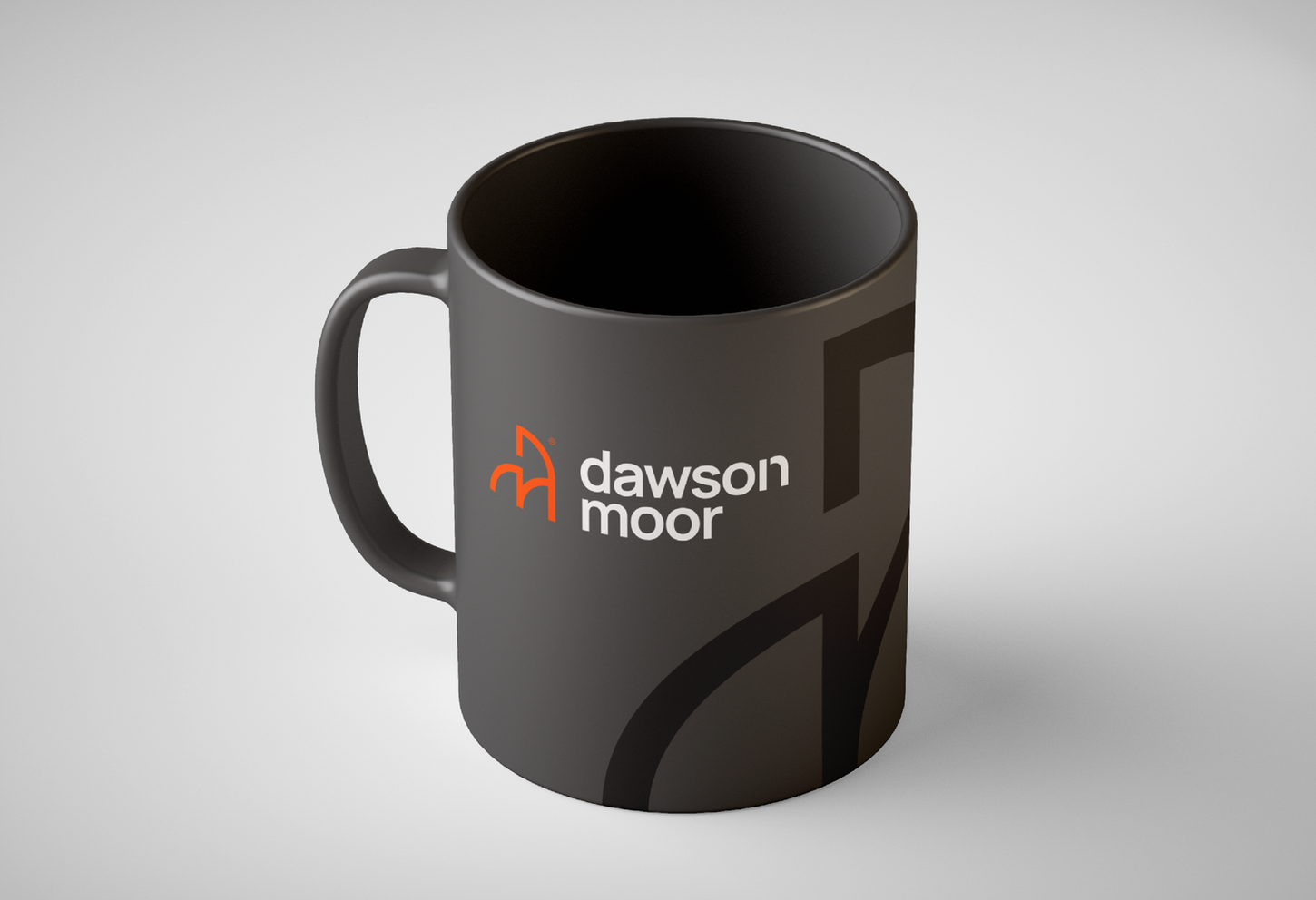
Three names were shortlisted based on their legibility and domain availability. The winner? A tongue-in-cheek play on words to squeeze "doors and more" into a reputable, family-run feeling brand name that oozed tradition. The client loved it. The logo mark combines three important elements; a stylised 'D' and 'M' monogram; the recognisable door symbols seen on building plans; and a subtle horse, symbolising strength and endurance. A slightly modified Manrope typeface completes the logo. A brand colour palette featuring orange, white, black, olive, and beige communicates a distinctive blend of energy, balance, and grounded sophistication. Once approved we supplied the client with a full suite of logo variations in various file formats along with a visual identity guidelines to keep the brand identity on track moving forward.


